
 |
| //krivoli.blogspot.co.nz/ |
COLOUR
SCHEME
This Complimentary colour scheme is fun and bold. It also shows you that a red and green scheme isn't just reserved for christmas.
You will notice this weeks blog is quite similar to last weeks, I've done this intentionally. It's a great way to show you how colour schemes and furniture choices can have such a dramatic impact on the feel of a space.
Throughout the image above there are curved lines that help to soften some of the sharp lines dictated by the room structure (doors, windows, etc). With the furniture and finishings you can see the rounding of edges on wood and circular objects (lamp, table), these help to achieve a more relaxed look.
There is selection of visual textures in this image that add to the excitement of this space. Seen in the wood grains, cushions, books and art, they contribute to the harmony achieved through variety of colour, texture, pattern and shape.

A Complementary Scheme is created by choosing two colours that are directly opposite each other on the colour wheel. Complementary colour schemes generally make for a very bold space because of the way they contrast each other.

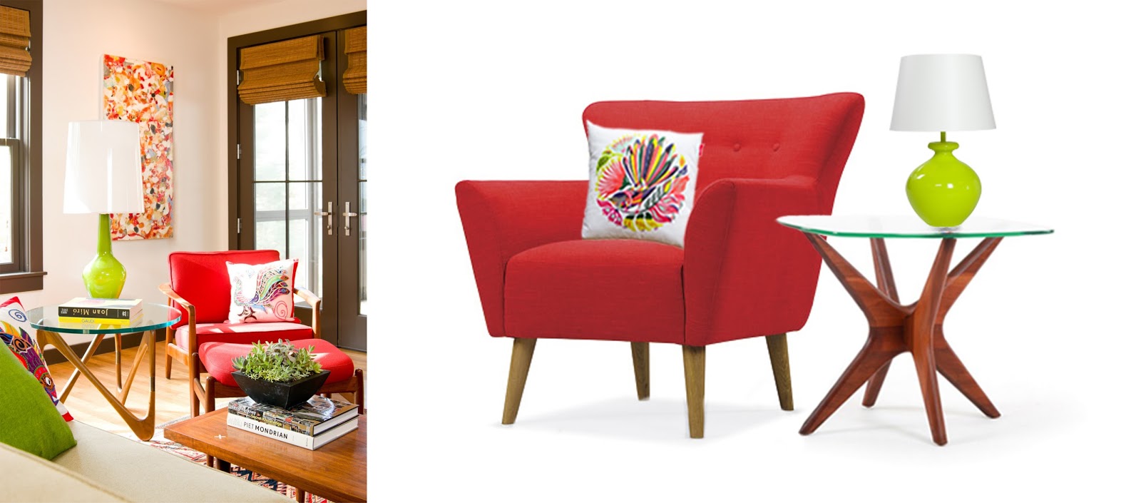
An interpretation.
When trying to replicate the mood and scheme that this image presents, the most important element is your colours, make sure that you use your palette to guide you through the selection process.

This armchair shares a good colour connection with that in the scheme photograph. Although much larger than the one depicted, making this the dominant piece and playing with scale in the other objects, you will maintain the quirky feel.

This mid-century style side table is a great substitue for the one in the photograph. It's aesthetic is very similar and it's legs compliment the shape of those on the selected armchair, as the side table and armchair legs do in the photograph.
 |
Although this table lamp isn't quite the same shape or size as the one depicted above, it is a great colour match, and still provides the essential pop of lime green.
 |
| Click here to purchase |
This cushion is a perfect, super fun interpretation of the one seen in the scheme image. Its not only a bird, and has similar colours... its a New Zealand native bird!
**When it comes to the soft furnishings and accessories, don't be hesitant to bring in more colours in small amounts, such as they have in the scheme image with the cushions, books and art.**
No comments:
Post a Comment